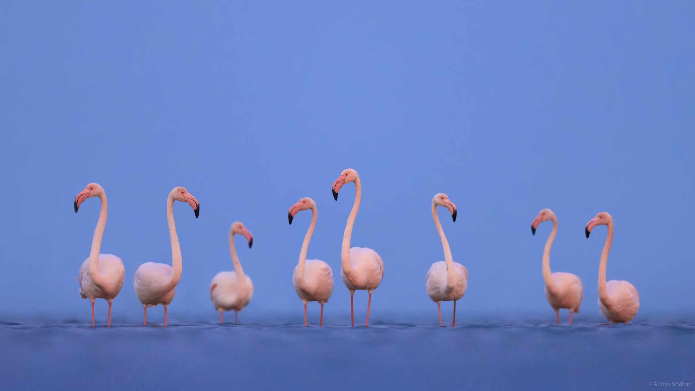
I haven’t done one of these post-processing blog posts in a long while, but I figured this photo deserved it. I shot this image of a flock of Greater Flamingos on a cloudy, breezy winter morning. The sunrise was still about 30 minutes away so, as you can probably guess, it was super dark; so much so that I wasn’t even able to see the birds with my bare eyes. I had to resort to manual focus, super-high ISOs, and a lot of prayer.
It’s something that’s really got my attention over the past year or so, though. Shooting birds well before first light is such a thrill and the images just have a unique, ethereal feel. The struggle isn’t, however, limited to just image-making. Editing blue hour images is, in my experience, the greater hurdle.
The Idea.
When I think of Flamingos, I usually think of a flock. That’s their definitive characteristic, in my opinion. The main thing to be aware of is to ensure that the head and body positions of the entire flock are in alignment which, needless to say, very rarely happens. The denser the flock, the more variables you have to deal with.
I’d been put off photographing these birds for that very reason. Not now, though. I kind of enjoyed the idea of a good photography challenge, especially after a relatively smooth (easy?) trip to Bharatpur. A few bruises, aching joints, and a lot of scrubbing down later, here I am with an image I’m really pleased with…
…or am I?
The truth is that while I’m very happy with the end result, there are a few things I need to get out the way first. This isn’t my usual style of image processing. I had to stack 3 shots, do a major cloning job, and resort to a rather dodgy way of noise reduction to get the image to where I wanted it to be. That is not to say that I manipulated the scene to such an extent that it is a misrepresentation of reality – it really isn’t.
Image editing is a very personal endeavour; even more so than image-making, I’d wager. Everyone has their preferences and, personally, I’m quite open to trying all sorts of editing styles and techniques. There’s always something to learn. What I try to be conscious of is to ensure that my edits, in no way, deceive the viewer or convey the wrong message. With that being said, I feel like I did explore new territories with this image and there’s a certain amount of discomfort associated with that.
The Image.

If you take a peek at the settings, you might get a feel for the kind of lighting I was working with. There were 3 primary issues I had to deal with while shooting these Flamingos:
- The head and body positions of the birds.
- The slow shutter speed and incredibly high ISO.
My back and arms.- The White Balance of the scene (WB).
In the field, there was little I could do to remedy these concerns. The breeze ensured that I couldn’t drop my shutter speed any lower. The birds, while mostly inactive, were constantly moving around, thanks again, to the wind. Choosing the right WB was tough, too, considering the lack of reference colors in the darkness.
This is where editing comes in.
The Base File(s).
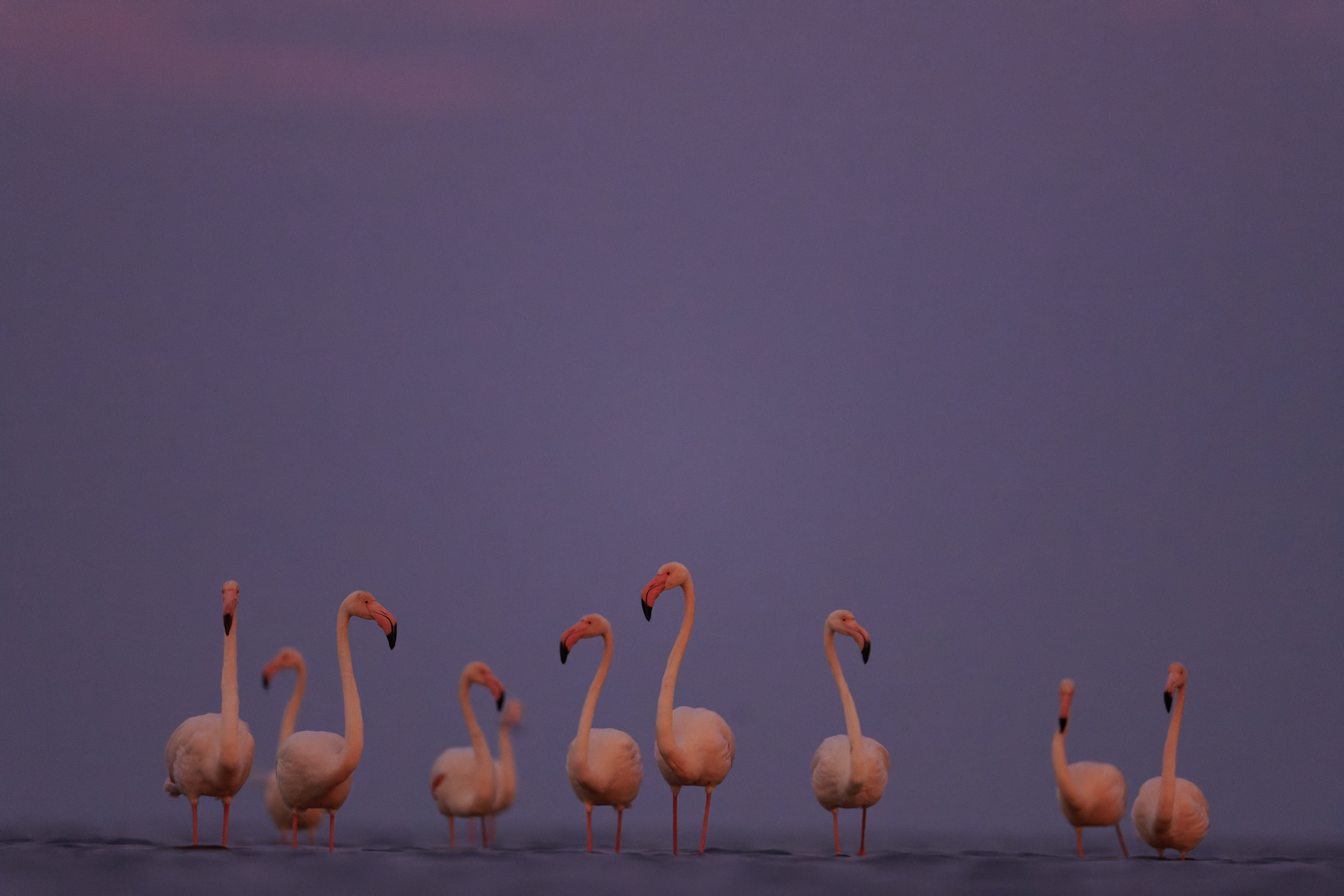
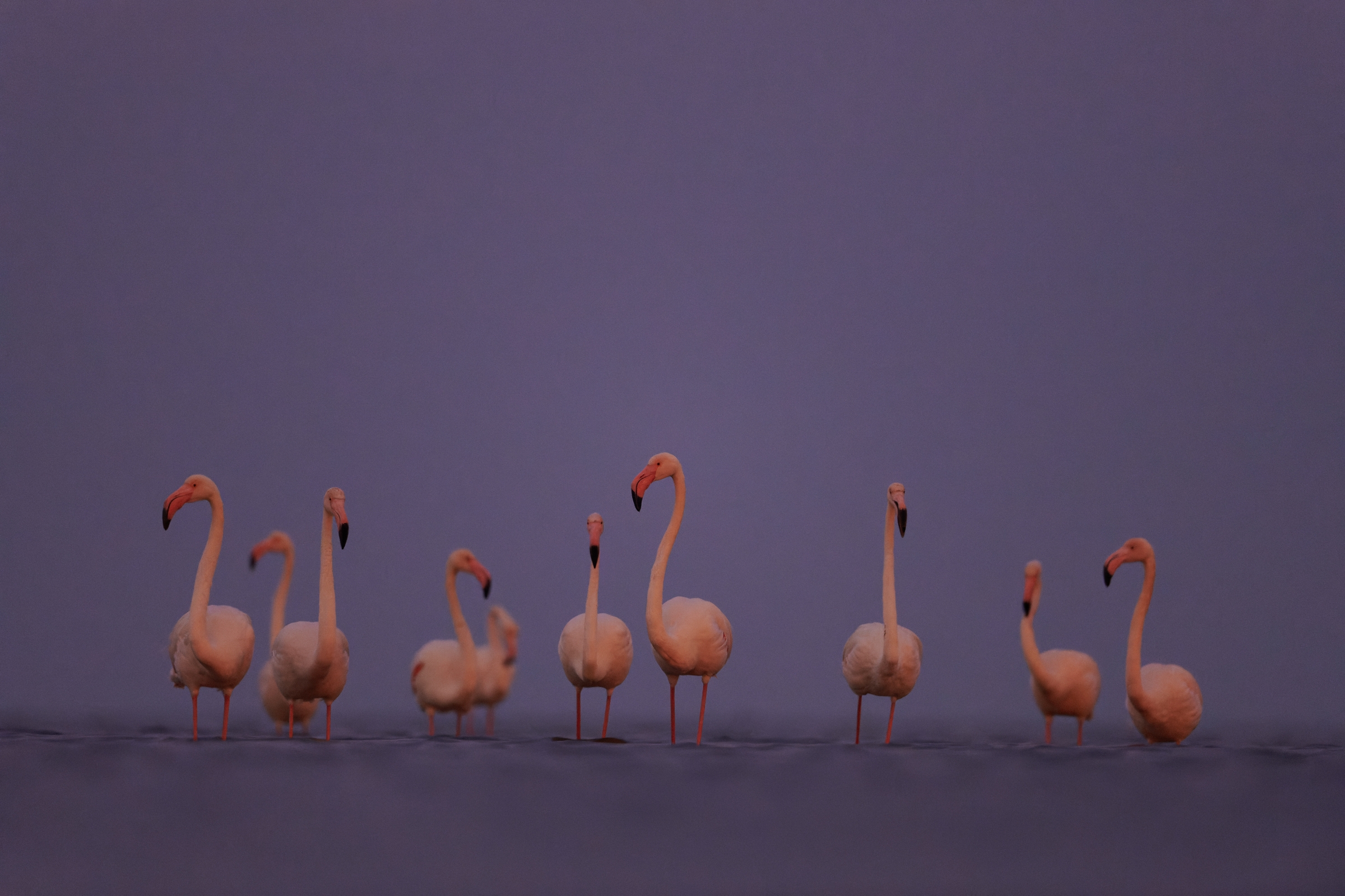
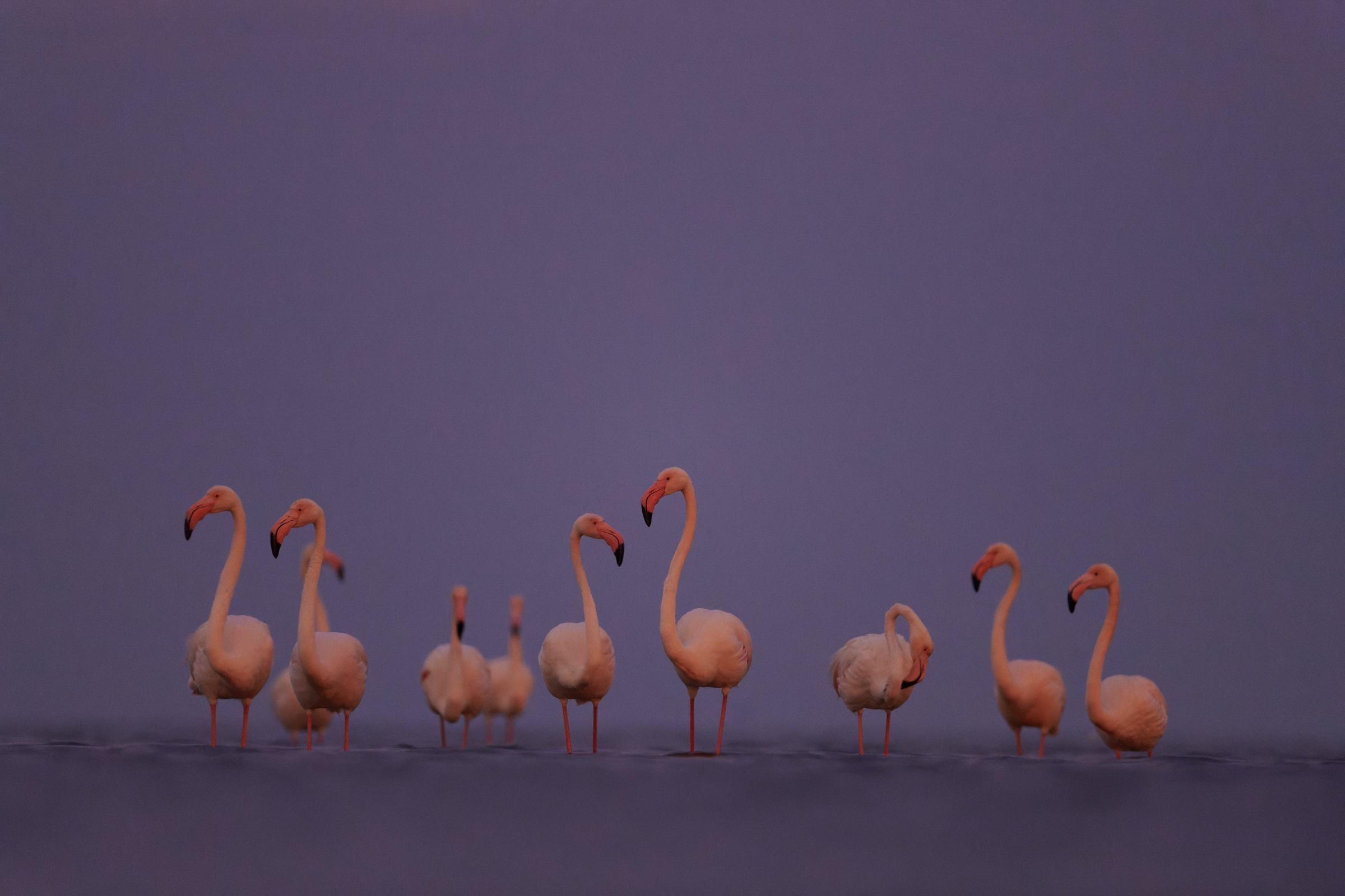
The unstable mud on the coast meant the first base file I used had no space at the bottom of the frame. This wasn’t a major problem, though, as I had many more images in the series to add space from. I picked the second and third images to layer over the base file and get the head positions I wanted on all the Flamingos. Before that, however, I had to do a few basic edits to the RAW files, namely changes to the WB and exposure.
Step 1: Basic Edits.
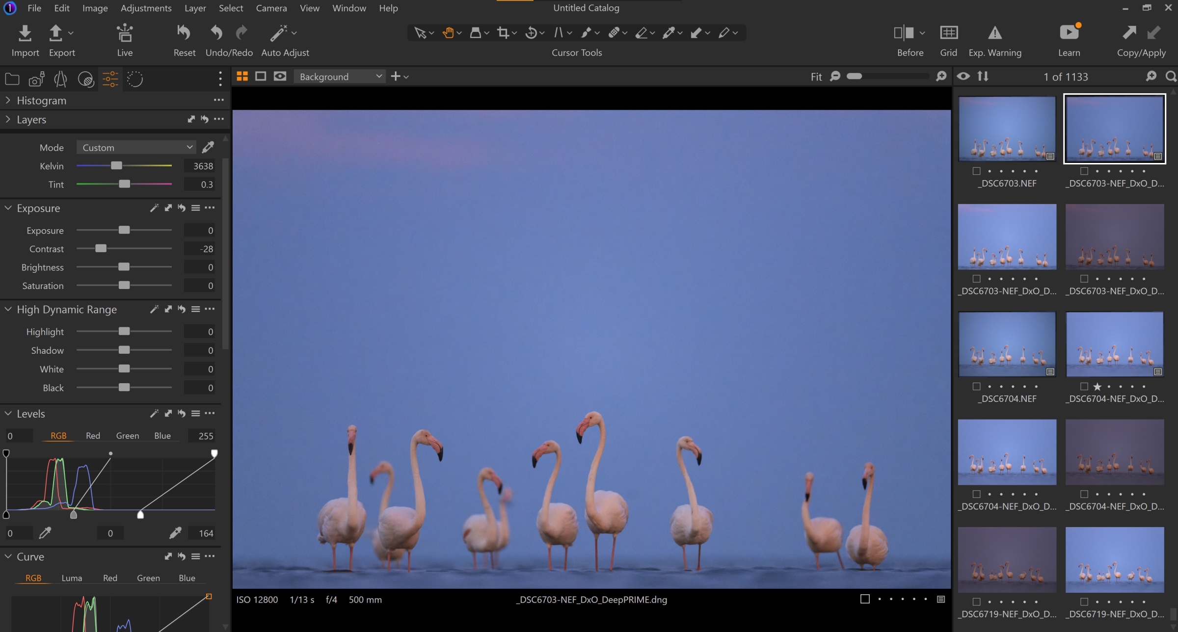
This was, quite literally, a two-minute process. I decreased the contrast levels a touch, and cooled down the WB to get the look I was after. The RAW file was much too dark and pink – more on this later. I also levelled the horizon and transferred the same settings over to the other shots from this series.
Onto to step 2, which is booting up Photoshop. This is where the fun (not really) begins.
Step 2: Primary Assessment.
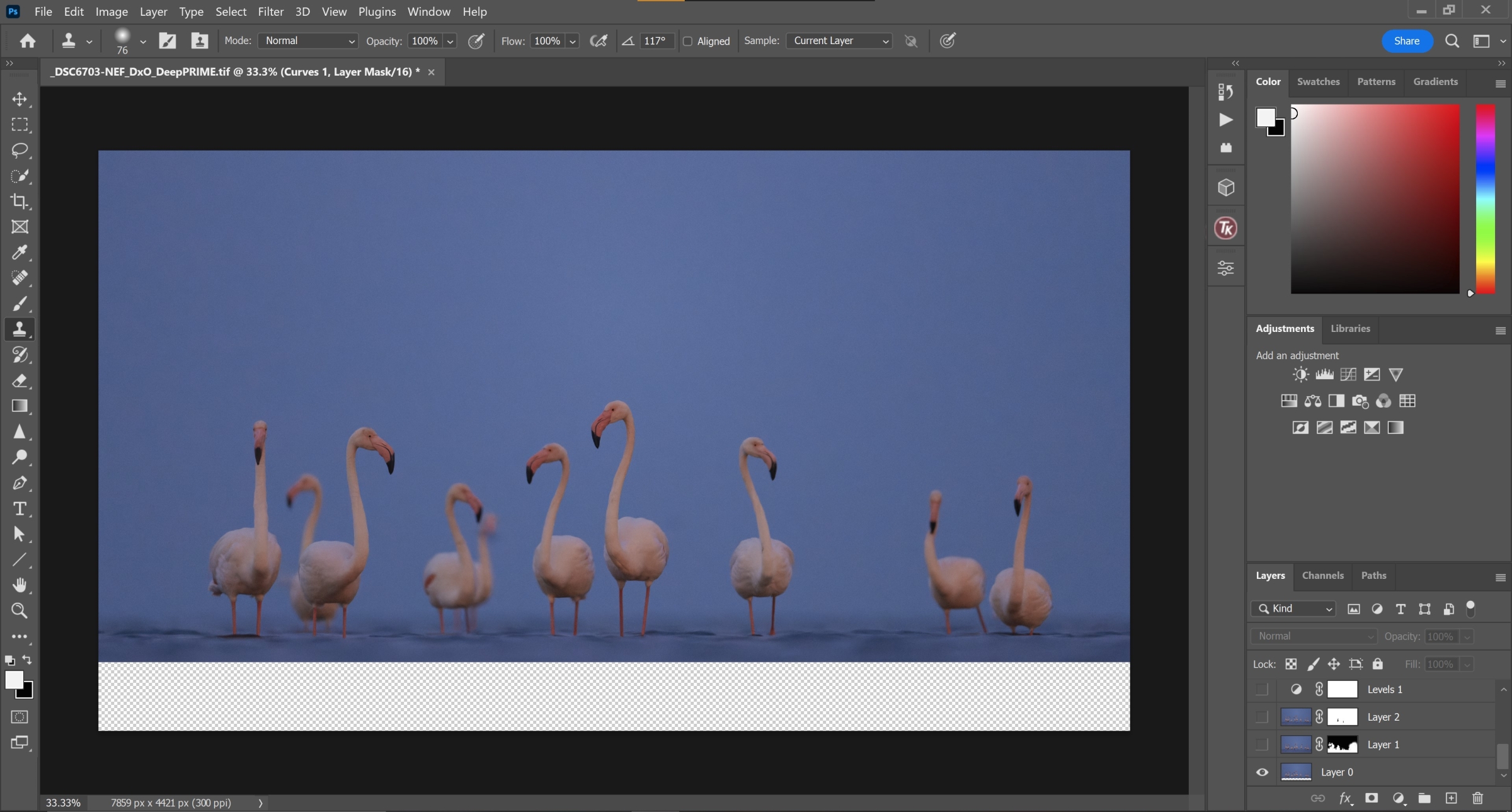
After making sure the edits were consistent across the board, I loaded the images up in Photoshop. The first task was to add some space at the bottom of the frame; easily done by masking the water in from the second image of the series. This was also the time to analyze the head positions of the birds. I got quite lucky with the head angles on 5 out of 10 birds in the flock, but the remainder were far from ideal.
Step 3: Head Transplants.
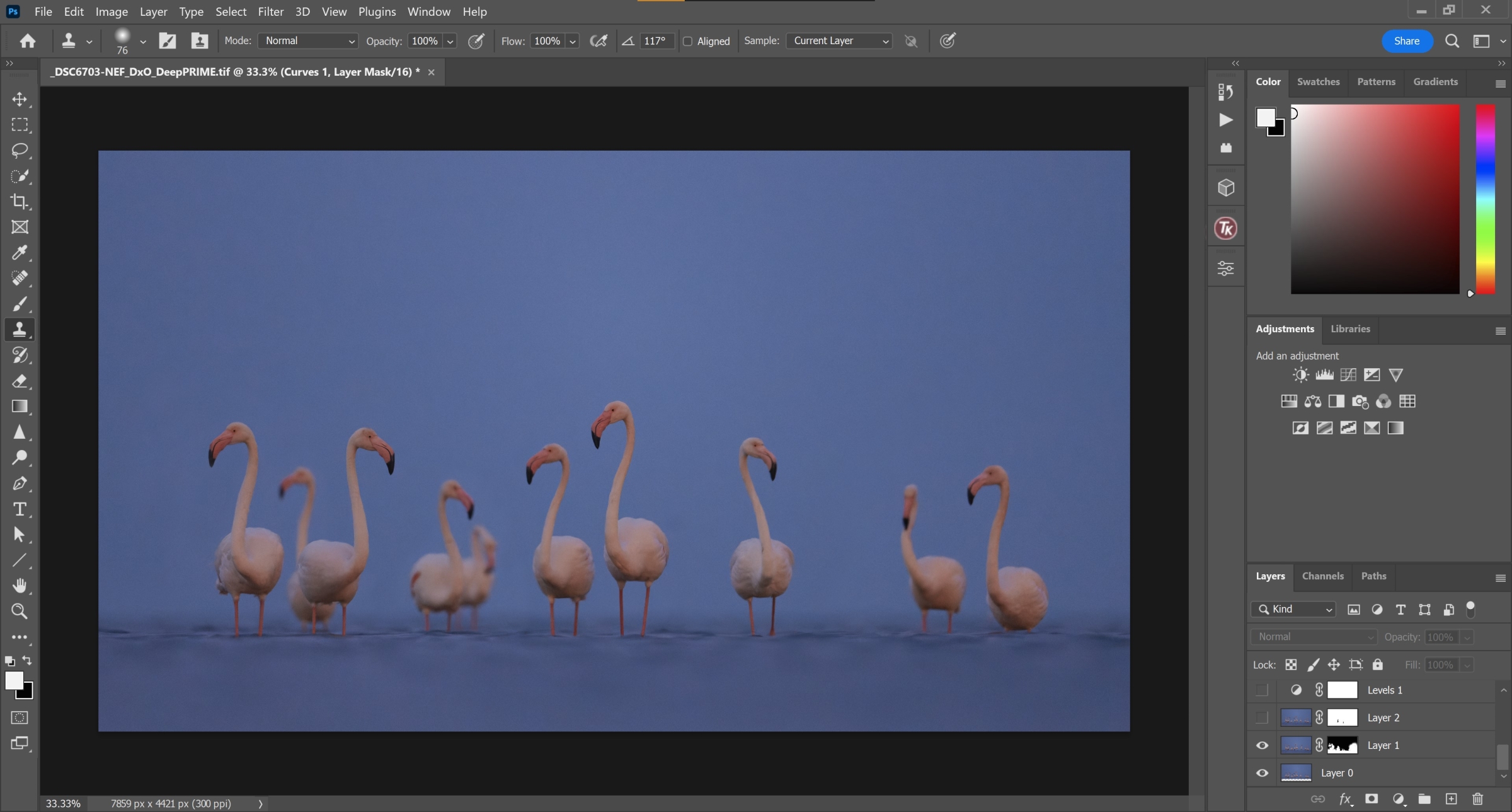
I overlaid the second image on top of the base RAW file and carefully masked in the heads of the leftmost and rightmost Flamingos. The image was looking much better already, and I wasn’t even halfway done with the processing. It was now time to address a problematic bird in the background (fifth from the left).
Step 4: Cloning.

Boom.
The Clone Stamp tool (in combination with the Lasso tool) worked wonders on this scene. I was able to easily remove that Flamingo and, in effect, create more separation between the rest of the flock.
Step 5: Levels adjustments.
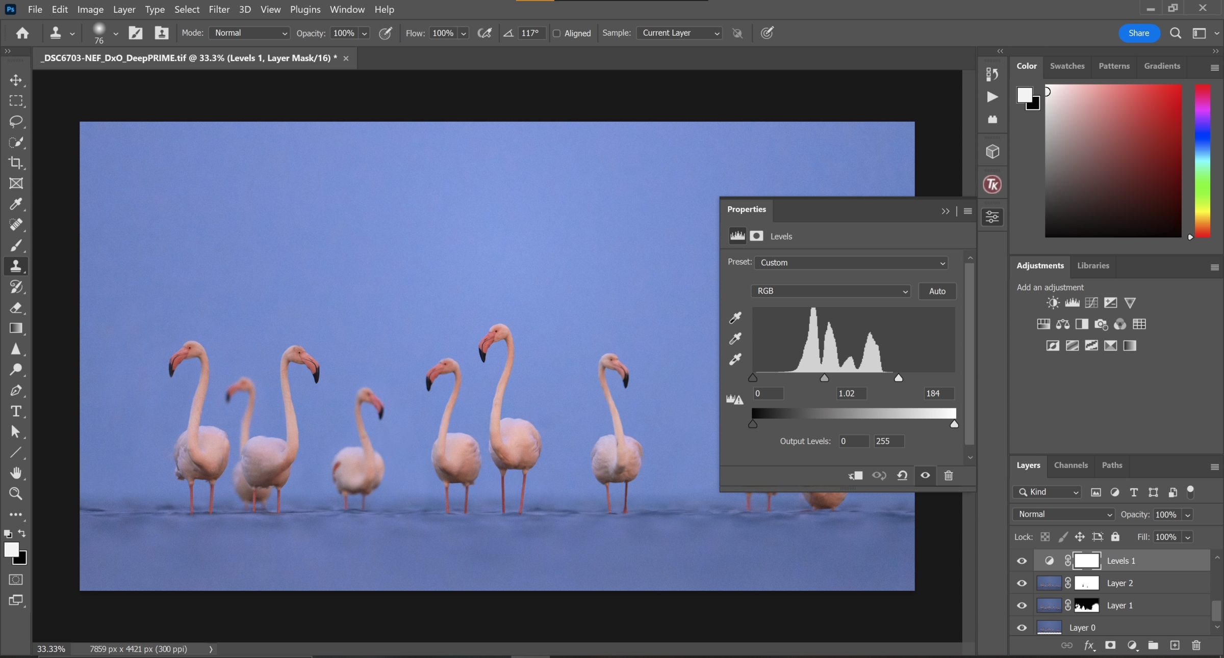
The image, at this point, was quite underexposed. Combined with the high-ISO, it was a bit of a disaster. Anyways, I opened up a levels adjustment layer to compensate for the low brightness and brought the exposure up. Unfortunately, this is also exaggerated the noise in the sky and the water. This is where I racked my brain to come up with a weird, but surprisingly effective, solution.
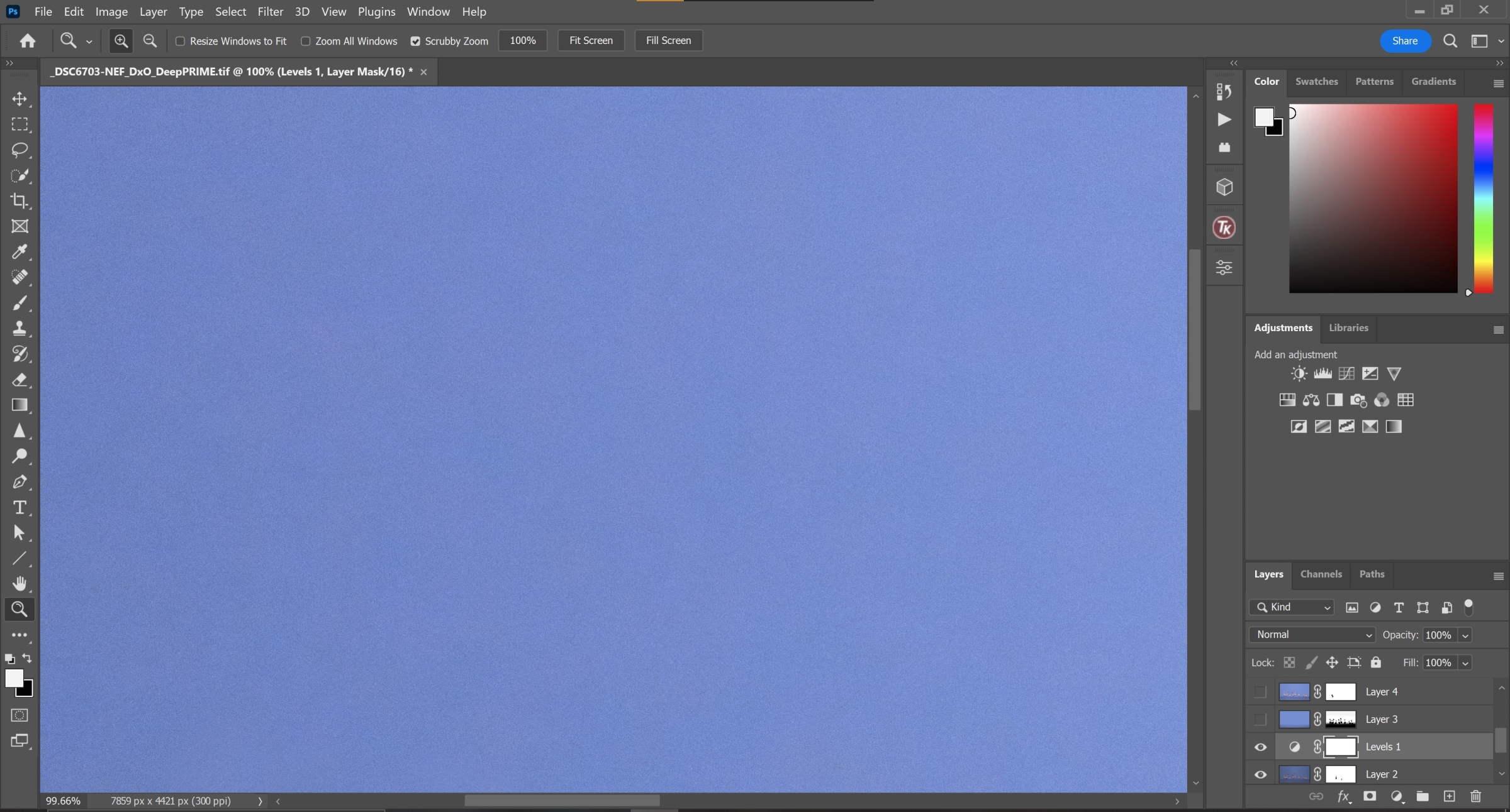
Step 6: ‘Noise Reduction’.
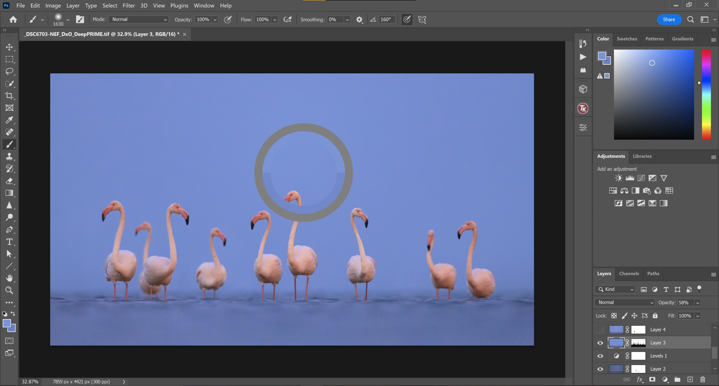
Given the lack of tonality and structure in the sky (besides the vignette in the corners), I figured I could paint over that region to minimise the noise pattern. I used a Color Range selection to create a layer mask that excluded the Flamingos and the water, and painted the sky using the Paint Brush tool at a low opacity.
Step 7: More Cloning, Even More Masking.
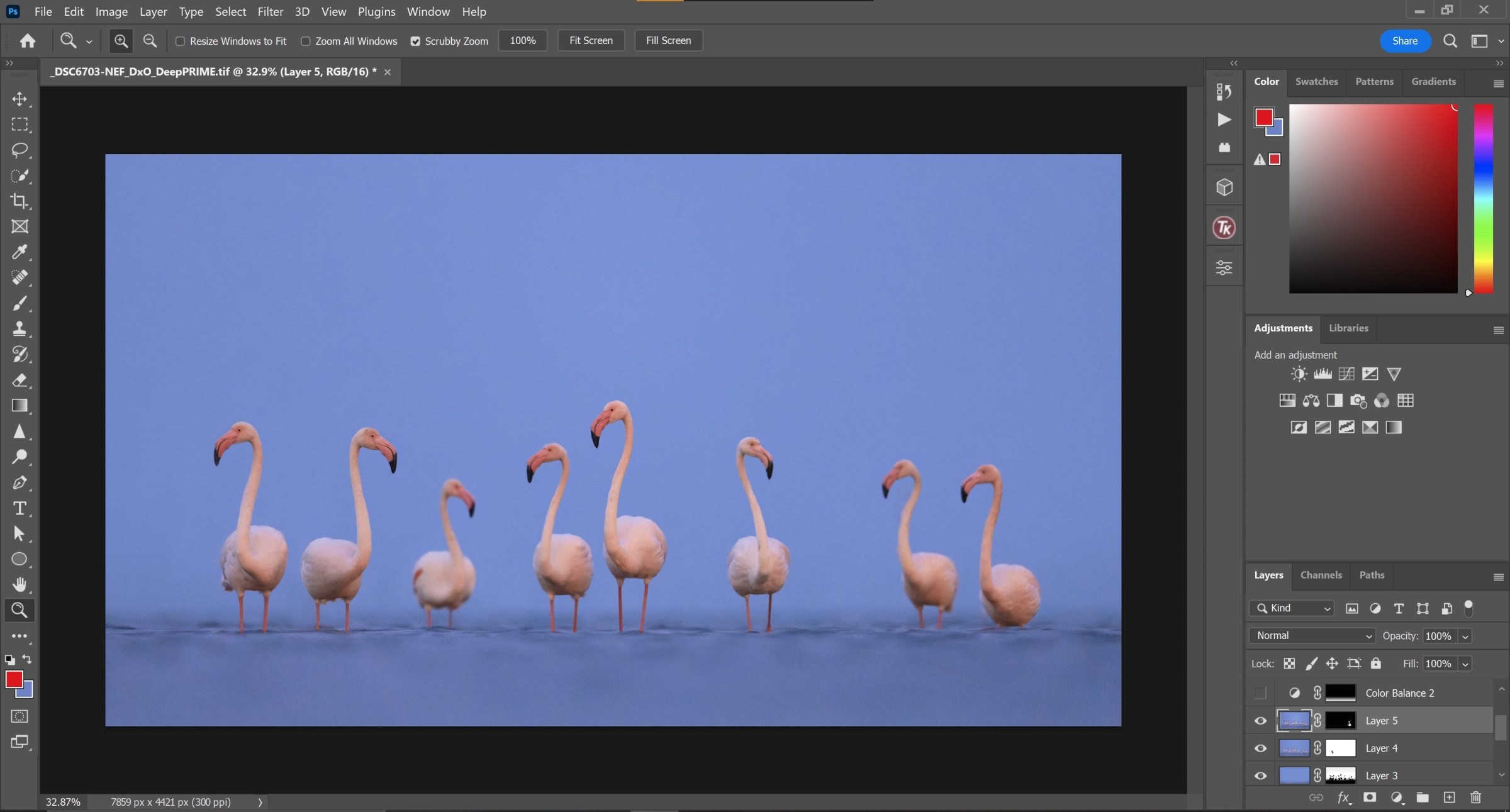
We’re in the endgame now…
Well, not really, but we’re close. After the previous step, I decided to go ahead and clone out the second bird from the left. I went back-and-forth on that decision, but I decided to commit to it. I also masked in the head of the second bird from the right.
This edit’s a fair departure from the RAW files and, at first, it might seem a bit disingenuous to state that this shot is a realistic portrayal of the scene. On the other hand, however, I do find it important to strike a fair balance between artistic appeal and realism. I’m not comfortable adding something that didn’t entirely exist in the scene, but I definitely do remove things that I find distracting.
It’s also worth nothing that the images I used to blend into the base file were shot just seconds apart. I feel like photo-stacking, in this case, didn’t take away from the realism of the scene for exactly that reason.
Step 8: Final Touches.
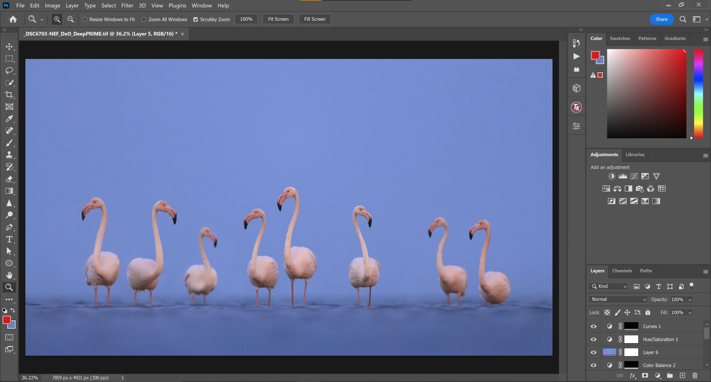
The final step was, thankfully, the easiest of the lot. I desaturated the Flamingos a touch because they were way too orange in the RAW file, and did a few hue adjustments to get the right shade of pink in their plumage. I also darkened the water a touch and added a hint of blue to that area.
Other Concerns.
Now, there is one important detail I want to discuss before presenting a before-and-after comparison, and that is the White Balance of the scene.
The colour temperature of a scene depends on a couple of factors – the actual lighting and the photographer’s vision. For instance, imagine a cold, foggy winter landscape, and try to identify the colours that come to mind when visualising said scene. Blue, cyan, and grey are the most likely candidates, and that’s because of the way our eyes process the underlying feel of those colours. Similarly, red, orange, and yellow are, often, associated with sunrises and sunsets.
Things become a bit more murky when the light is close to non-existent, however. If you remember the base RAW file from earlier, you might be able to recall how warm and pink the colours were. Well, here’s how they looked on my camera screen in the field.
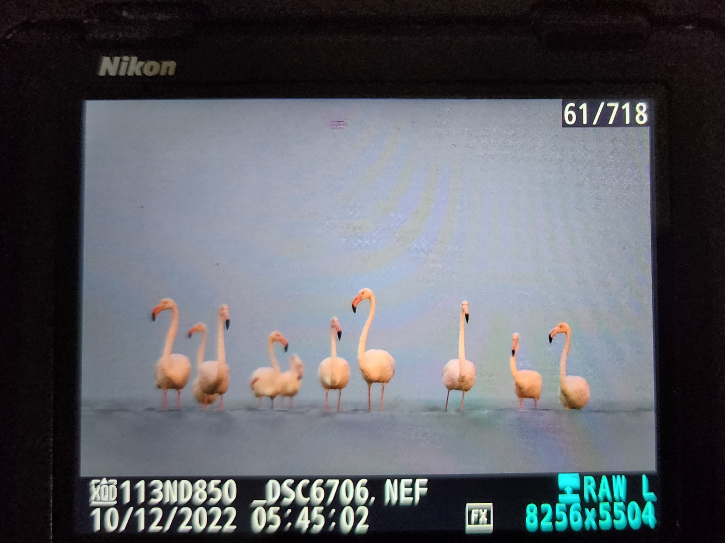
As you can see, the image is decidedly cold. That’s kind of how the scene looked to my eyes as well. Then why does the base RAW file look so different when viewed on my laptop? That’s because every software views the same image differently; CaptureOne, Adobe Photoshop, and the camera’s own in-built processing have their own unique interpretation of the colours, contrast, and White Balance of a photograph.
What a nightmare. I had no real reference to base my edit on, so I decided to just go by the colours on my camera’s LCD panel. It was far from ideal, but it got the job done in the end.
Conclusion.
This image was a bear to edit, but I’m quite happy with the final version of the shot. These Flamingos were amazing subjects and I’m glad I was able to capture the image I was after. I’ve already elaborated on my thoughts regarding the post-processing of this picture, so I’ll leave you with the before-and-after comparison. I hope you found this post interesting and informative. See you in the next one! 🙂



Nice, never seen that noise reduction technique before! It’s interesting how the details on the flamingo kinda masks the noise on them more then the solid bg so even tho the bg got more noise reduction there isn’t an obvious difference in noise levels to the viewer. It doesn’t have the odd look of noisey birds on a perfectly clean bg.
Author
Thanks a lot man! That’s a neat observation. Yeah, the detail on their feathers definitely helped a ton. I didn’t have to apply any additional noise reduction on the birds after the initial run through PureRAW.